Stake
Affiliate Program web simplification
-
For Stake, Affiliate Marketing accounts for a significant portion of their revenue. My mandate was to take the exisiting Affiliate Marketing funnel and reimagine it from the ground up with a view to streamline the process and increase its appeal to new affiliates.
-
15% increase in new Affiliate traffic across the website.
12% increase in NPS among existing affiliates.
38% increase in overall site traffic YoY.
-
Wrote the Good Tings microsite which translated Netsafe online safety jargon into engaging copy aimed at teens.
Helped co-create the ‘First Phone’ unboxing experience including packaging design, brochure content and the First Phone Safety Contract.
Wrote corresponding copy for the 2degrees website to provide a consistent experience for parents and teens exploring the program through the brand website.
Wrote outdoor billboards to drive brand awareness for the campaign,
Step one:
Audit existing structure
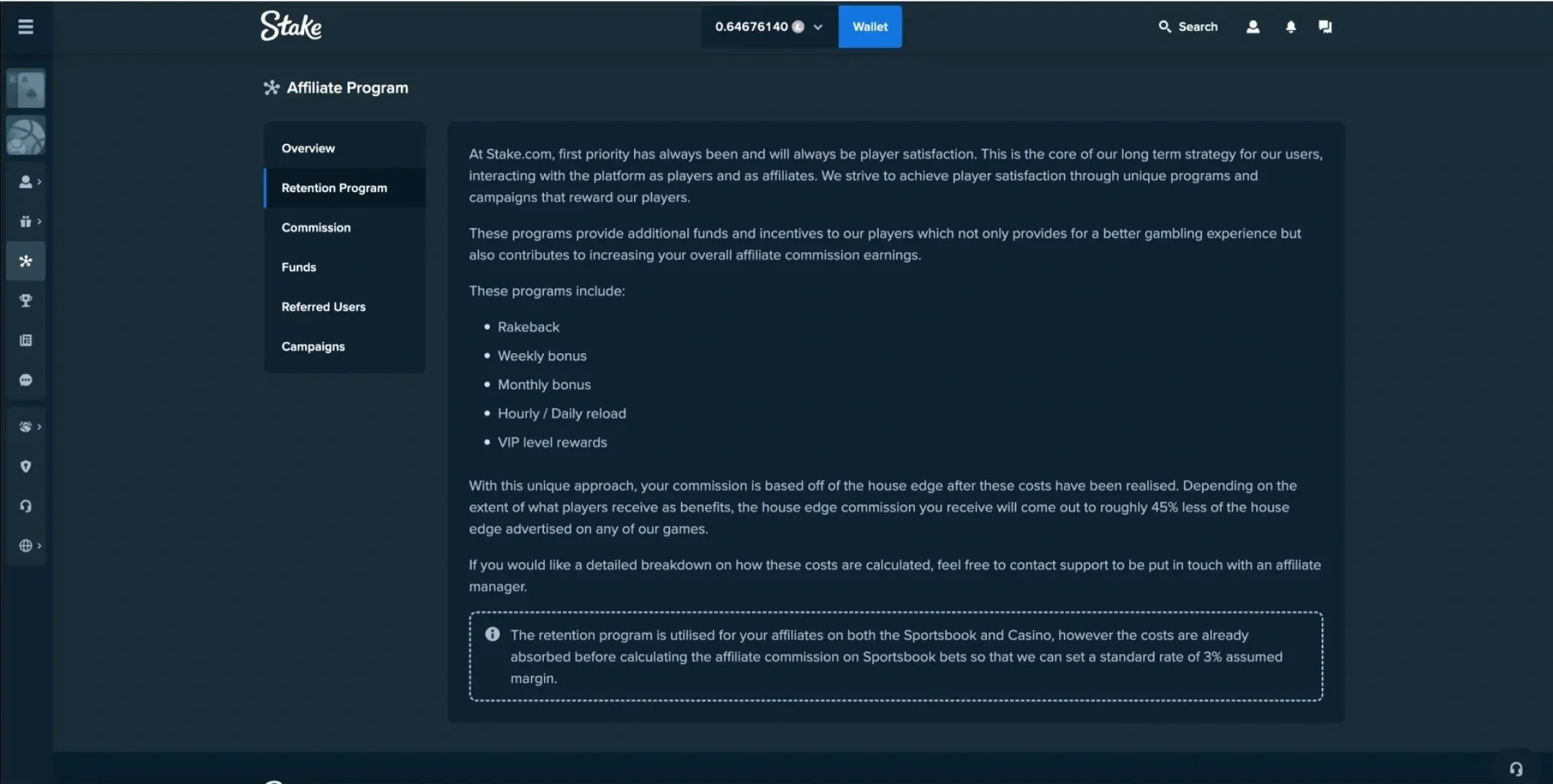
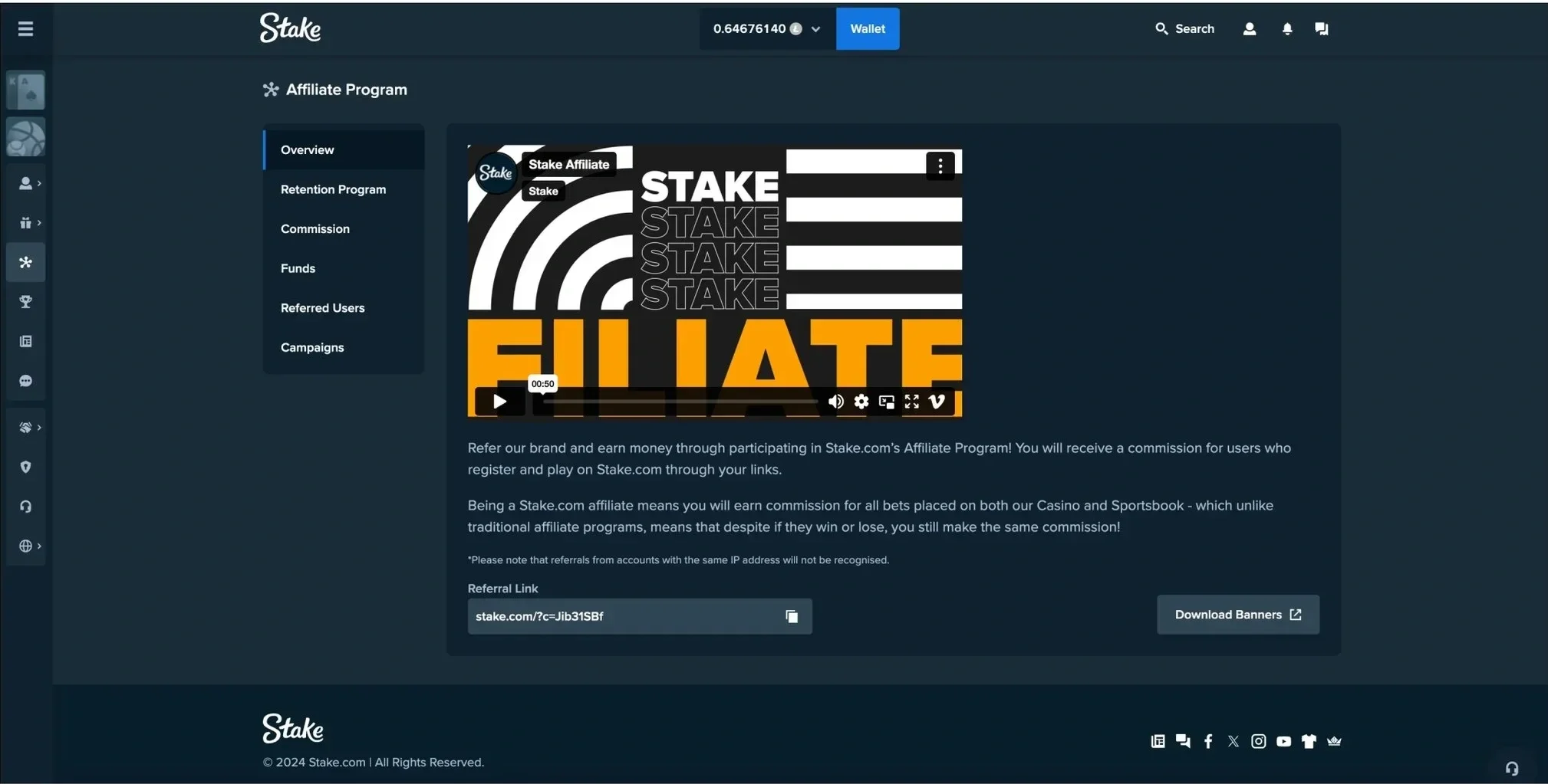
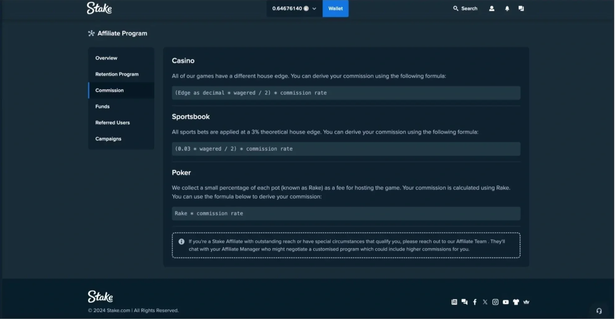
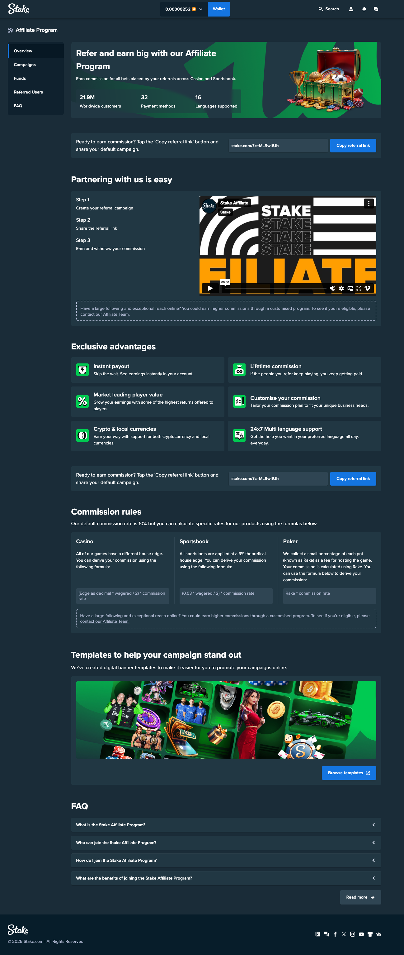
To begin, I had to find the paths of friction within the current structure and the workflow behind it. The existing design sectioned the information into multiple, unnecessary tabs with scant visual relief and no clear path to action for a new affiliate.
Step two:
Audience research
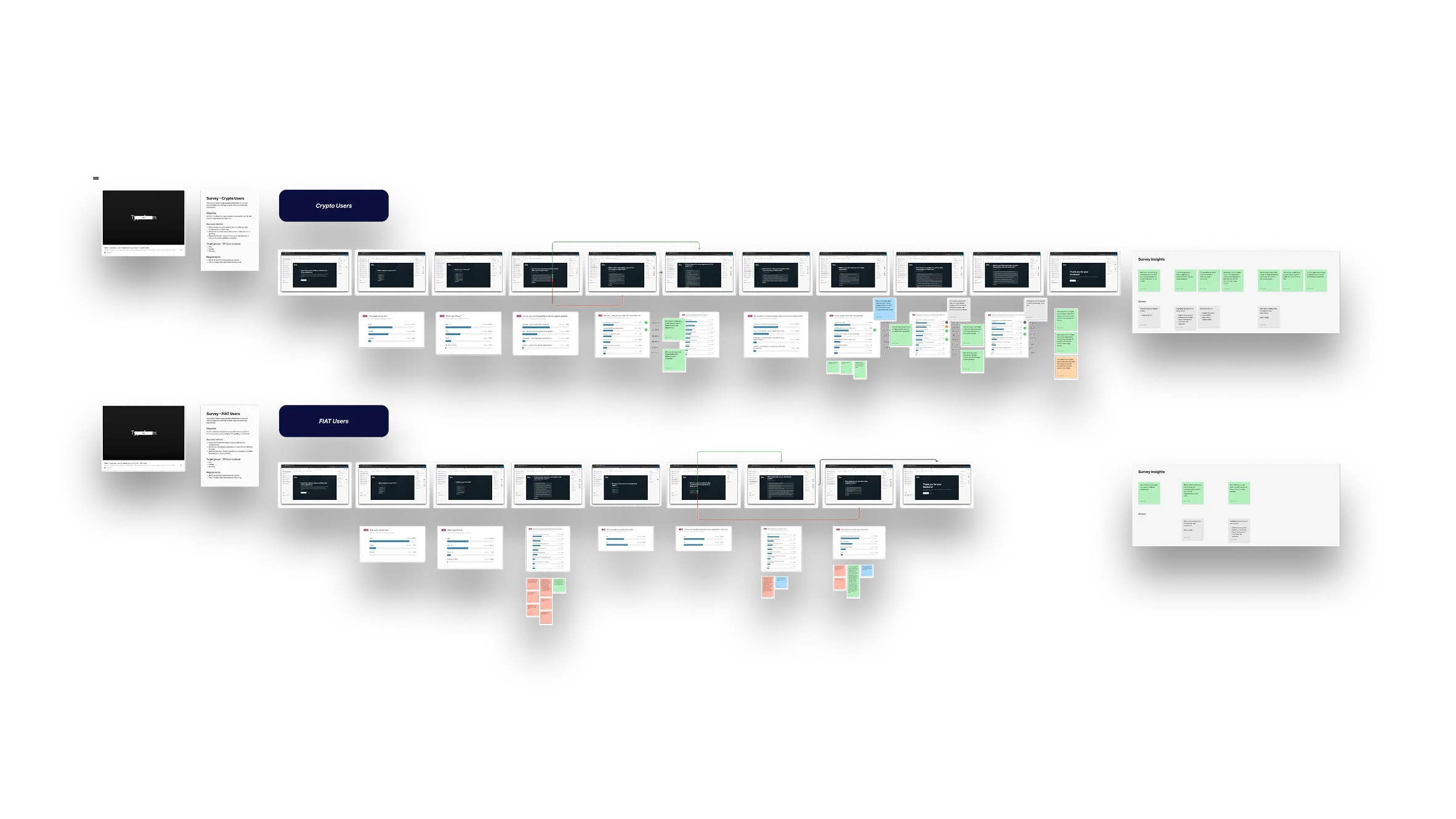
I ran two surveys targeting both existing high-value affiliates and new users who had been recently signed on to Stake by an affiliate. Across 1500+ responses, a clear pattern emerged: existing affiliates were finding it hard to customise their campaigns and new users were curious but unable to make sense of the information currently available on the site.

Step three:
Reimagine the content flow
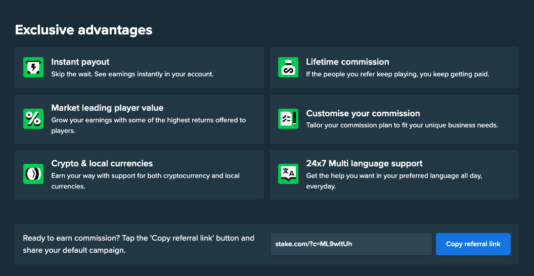
Working with a team of UX and UI designers, I wrote a new content layout from the ground up. This page built the product into a single flow page with fewer tabs. The benefits of the program were laid out with increased clarity for new users and features like downloadable templates were made to stand out for existing affiliates.